ALCOHOL BRANDING
Packaging That Drives Sales
With nearly 50 years of experience, CF Napa has unparalleled strategic knowledge of the alcohol beverage space. We are experts in alcohol beverage branding uniquely qualified to partner with you in positioning your spirits brand for success. CF Napa provides and harnesses key insights to develop spirits brands that create pull, translating to increased sales and long-term loyalty. We’ve won thousands of awards for our package designs, but more importantly, we’ve helped our clients sell millions of cases — and we have the case studies to prove it. Our expertise includes:
- • Spirits Label Design
- • Spirits Package Design
• Spirits Logos - • Custom Spirits Bottle Design
- • Spirits Capsule & Closure Design
CF Napa creates exceptional packaging that encourages consumers to purchase your product, amplifies their tasting experience, and leaves a memorable impact so consumers are able to recall your brand when they are ready to rebuy.
![]()
About Us
For 50 years, CF Napa Brand Design has set the standard in the drinks industry. Under the leadership of Owner & Creative Principal David Schuemann for the past
24 years, we have developed and restaged countless brands through story, packaging, and visual ethos.
CF Napa’s expertise lies in our process—from project conception to conclusion, we balance listening with leading to execute solutions rooted in strategy that connect strongly with consumers and drive sales, whether in the domestic or international marketplace.
- • Alcohol Brand Experts
- • 50 years of experience creating strategic solutions.
- • Materials & sourcing experts, with best-in-class vendor relationships.
- • White glove from start to finish.
Brands We Have Helped
OLDE RALEIGH DISTILLERY
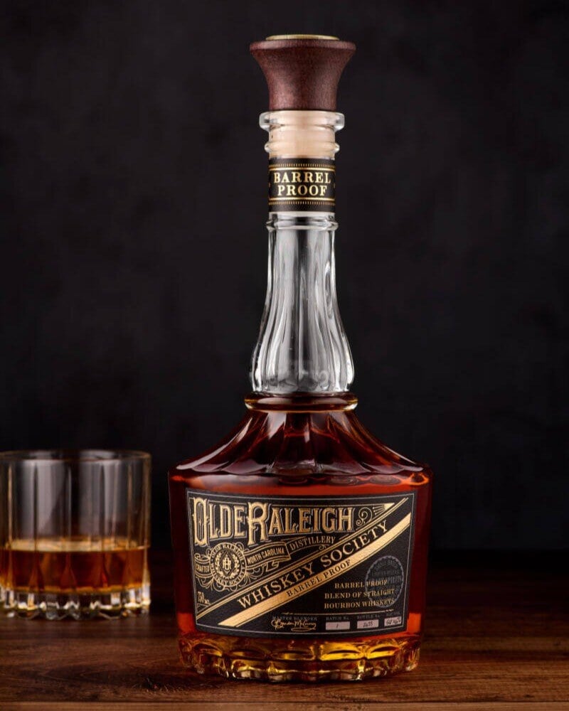
Olde Raleigh Distillery engaged CF Napa to design the logo, packaging and custom bottle for their new distillery and line of whiskies. We created a bespoke bottle inspired by antique crystal decanters. The intricate seal for the distillery and their Whiskey Society membership, modeled after the seals of historic private clubs and secret societies, was embossed both into the metal coin atop the closure and into the base of the bottle.
See The Full Project
ROBERT'S VODKA
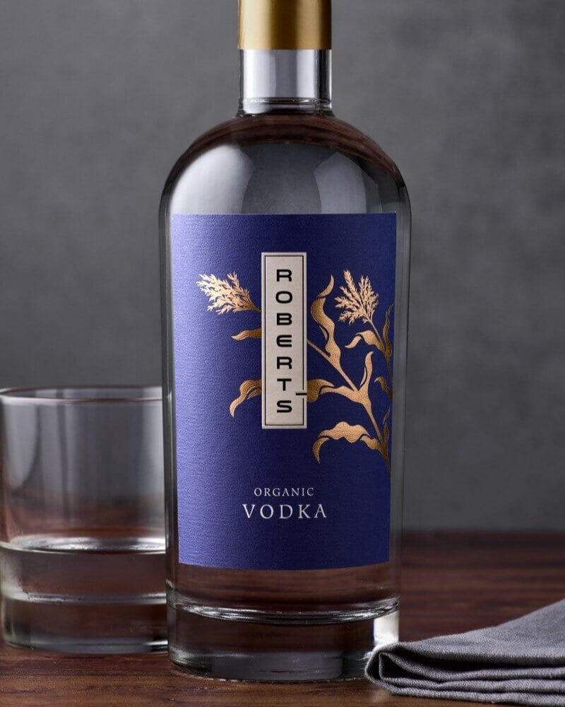
We drew a corn stalk to represent the organically produced American corn that forms the foundation of the Vodka. The drawing was gilded in gold foil and popped against the rich plum hue of the label. For a subtle textural detail, dainty lines in the corn illustration were micro-embossed. The Robert’s wordmark was transcribed vertically in a contemporary font, hinting at the inspiration the brand takes from Asian design.
See The Full Project
TK MULLIGAN
The lifestyle brand celebrates the unwavering determination of the golf enthusiast and those who are bold enough to take a second chance. The design needed to capture the easygoing nature of a round of golf, the legend of the brand’s spokesperson, TK Mulligan, “The Father of Second Chances”, and highlight some of the nation’s most famous golf cocktails. CF Napa developed a wordmark incorporating a golf pin into the “I” of Mulligan. The cocktail names were written in a script type reminiscent of those utilized by iconic golf brands. The bursts of color highlighted the brand’s tagline created by CF Napa encouraging imbibers to, “Take That Corrective Shot.”
See The Full Project
EL CONDOR
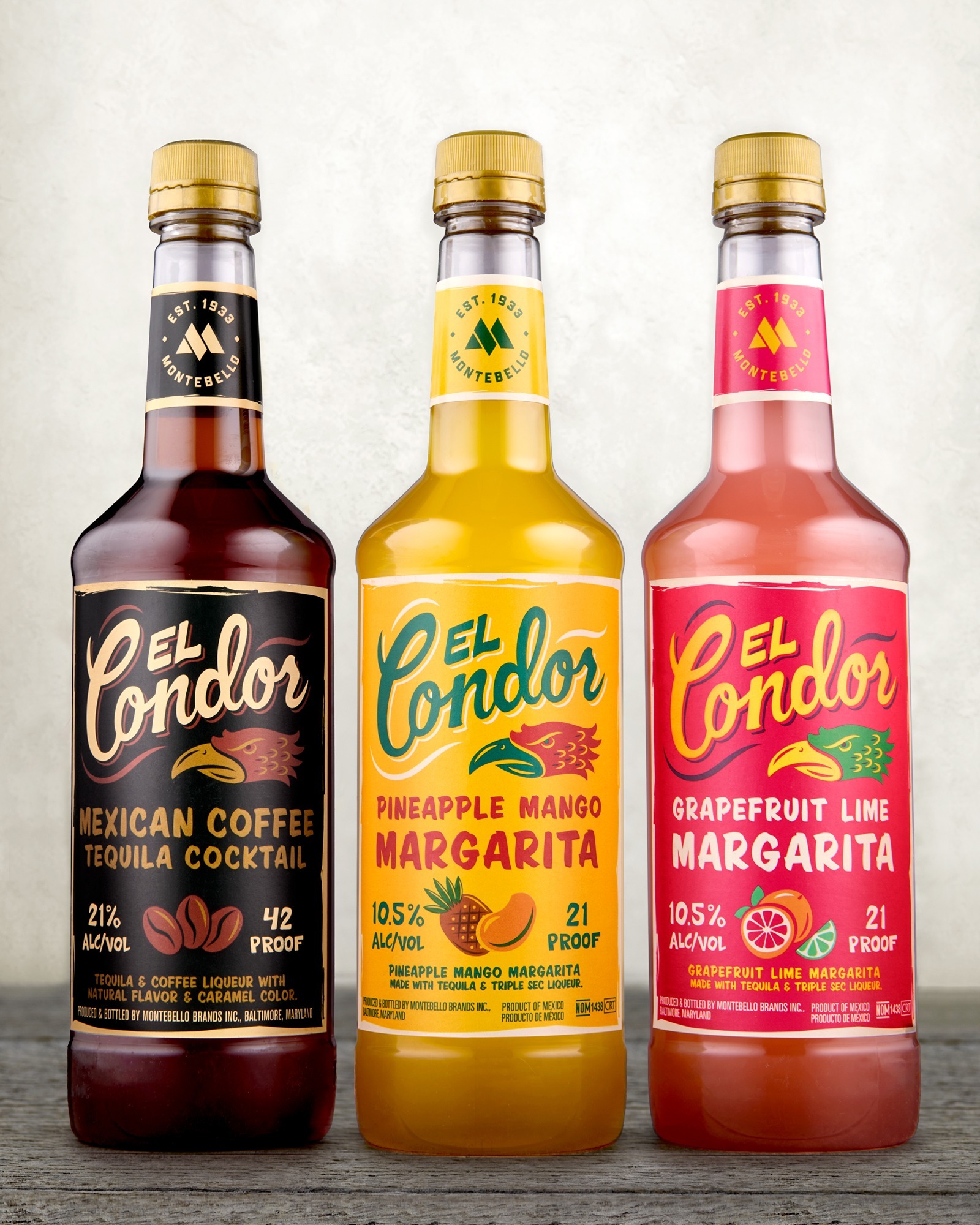
We developed a label design system utilizing custom illustrations and a condor icon combined with hand-drawn typography reminiscent of rótulo: hand painted signs seen on small businesses throughout Mexico. The flavor-driven designs are eye-catching and engaging, using color to reflect the flavor notes of each cocktail. The Montebello Brands logo is used on the neck labels to reinforce the master brand across the El Condor offerings as well as the larger portfolio of Montebello Brands products.
See The Full Project
In Our Clients ’ Words
“We wanted contemporary designs for the gin and vodka, but traditional for the rum. Despite the demands for significant differences in the style, CF-NAPA scored home runs in each case. We have been consistently impressed with the professionalism and creativity shown by CF NAPA. They listen carefully to the design brief and are very helpful in refining it. We are very frequently complimented on the designs, and there can’t be better praise. We will definitely continue to work with them.”
Robert Woods
Founder
Oak House Distillery
“In working with CF Napa for our packaging, my goal was to make something timeless and cherished, in hopes that it would be re-purposed and not just tossed in the bin. Their team absolutely hit the nail on the head. Not only has our bottle won numerous awards, you can see in people's faces that they are in love with it. We also hear from a lot of people about the creative things they do with their empty Waikulu bottles, so we’ve happily met our packaging goals.”
Paul Turner
Owner
Waikulu Distillery
“In the first 6 months following the launch of the new brand packaging, we sold three times as much product as we had ever sold in a year previously. No question. [The redesign has] been an absolutely integral part of our relaunch success. The folks at CF Napa have been a pleasure to work with. Their work is world-class and has been an essential part of our rebrand and relaunch success in market”
Brandon Joldersma
General Manager
Coppercraft Distillery
Drink With Your Eyes®
Every day we make countless decisions based on the sensory information available to us, and many of these decisions are subconscious. In the aisles of stores or online, when we are not afforded all our senses, we often must make choices based solely on the appearance of a product.
We drink with our eyes.
This is our foundational belief at CF Napa Brand Design. Visuals profoundly impact consumer decision making. When done strategically and perfectly matched to the consumer and the brand promise, the look and feel of the packaging captivates the consumer in three ways:
- • Encourages trial of your brand over others in the marketplace.
- • Reinforces quality of your product while they are enjoying it. Consumer testing verifies the power of packaging. A consumer may like or dislike an alcohol beverage when the only difference is the packaging; falling in love with the product when it is poured from a package they like and disliking the same exact product when in a package they don’t like.
- • Assists recall of your brand when they are ready to buy again.
Awards
